Monday 15 December 2014

Graphics Mock Photo shoot of Images

These are the photos that I took, and I has to chose one of them as my magazine cover. 


Graphics Mock Magazine Cover Draft

Here are the two magazine cover drafts.

Graphics Mock Final Magazine Cover

This is the final design of my magazine cover.

Graphics Mock Work In Progress

I've taken around 30 photos beforehand, and then by using Adobe Bridge CS4 to create a contact sheet, so I can select the photos that I want for my magazine cover.


 For the contact sheet, I've chosen the template to 4x5 cells, which is a suitable size to fit all the photos in.
 Afterwards, I saved the contact sheet into my graphics folder.
Then I open the contact sheet in Adobe Photoshop, so I can use the Brush tool to do some crosses on the photos that I don't want. As for the photos that I like, I leave it there and add some short comments about what I like about it alongside.


After choosing the photo for the magazine cover, I then open it in Adobe Photoshop and start to do some editing, like to cover up some flaws like the wounds on her finger by using Brush Tool.


Then I open a new document in Adobe Indesign, and insert the photo in it by using the rectangle frame tool.

Then I typed in some cover lines and the masthead also barcode into the magazine cover to finish it off. For the masthead I used red modern typeface because it enhances the elegance and classiness of the magazine, also the red and yellow colour contrasts with the cover photo, as it has cool colours like dark grey and black.


Wednesday 3 December 2014

Stencil Spray Work In Progress

First I chose a picture and insert it into Photoshop.

Then I set the saturation of this picture into -100 which makes it into a black and white picture, and then also set the input level.


After that, I go onto Filter, then to Artistic and go onto Cutout, to make the number of levels into 3, which there is going to be only black, white and grey tones in this picture.


3 layers will be needed, so I used Magic Wand Tool to select the black area to colour it into black, so this is going to be the first and the darkest layer of this picture. And do the same thing to the grey and white area.
 This is the grey area of the picture, then I colour it with black and this is going to be the second layer.
This is the white area of the picture, then I colour it with black and this is going to be the third and last layer.


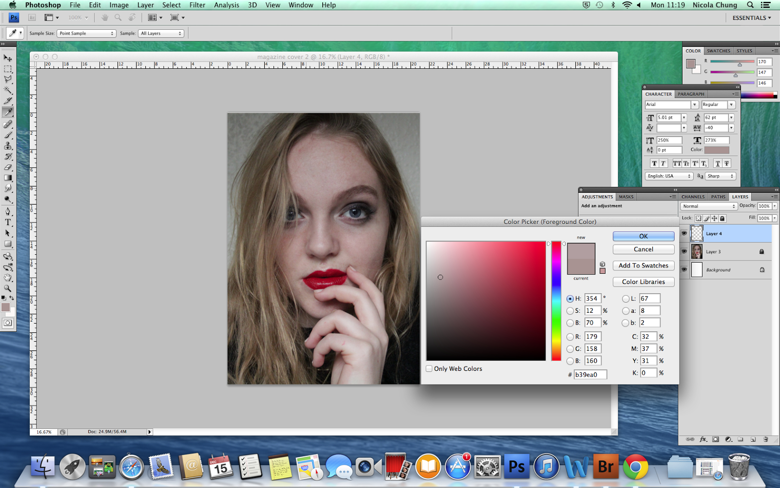
To use this sprayed portrait as a magazine cover, I colour the 3 layers into different shades of blue.


After fill in the colours onto different layers, by putting all 3 layers into one and so the features of the portrait is visible.


I then added a text box on the top of the magazine cover, which is going to be the masthead 'SUMMIT', and I used pink colour so that it stands out also it contrasts the blue colour of the portrait.


After adding in the masthead, I also add in other texts such as the cover lines, date etc on to the magazine cover. For the cover lines I used the colour pink, white and black to create some contrast on the magazine cover.

Then I used the Brush Tool with the colour white with a new layer and start to stamp onto the texts.


Friday 14 November 2014

John Panelreader Business Card


I've used different the texts fonts and re-arrange the texts position to make the business card look less boring also make it look more interesting.
The original business card, the texts were distributed in every corner and at the centre of the card, then I re-arrange the texts on the right-hand side, which makes a single alignment so it activates the white space on the left-hand side of the card.
I also changed the font type and size, like ' Awesome Comics!' to make it bigger and a more interesting font type, so it could stand out more than the rest of the texts because it creates a contrast.
For 'John Panelreadrer', the address and contact, I used similar fonts with both texts, which one uses san serif and the other uses serif, one is thicker and the other is thiner, so each is similar to each other but there is a slight difference between them.
Since all the texts are align on one side and it is in close proximity to each other then become one visual unit, so it makes more organise and make it more easier to read.

Tuesday 21 October 2014

Magazine Work In Progress

First I've done something research on magazine cover and layout through Pinterest, then choose one of them to start of.


Then I took some pictures of a person and to make sure that the posture and facial expression are as similar as possible.
In InDesign, I typed all the texts on the magazine front cover, also to adjust it to the right font size and change the font colour.

As all the texts are typed up, I then insert the wanted picture and place it on the template to finish off the magazine cover.

After doing the magazine cover, I then start onto the double page content. First I insert a photo in Photoshop and do some editing, because there are some white rectangle boxes with a see-through letter in the original magazine, so i used the horizontal type mask tool to do the same thing to make the spread page look identical. 


Then back onto InDesign, i insert the psd file in there and to transform it into the right size to fit in the page. 

For the other page, I inserted the text but there is a black box with a capital letter 'D' in it, so I used Photoshop to create it.
First I coloured the background into black, then I added a text box to insert the capital letter D with the correct white colour font in. 

After that, I inserted the black box that I just made in Photoshop into InDesign. As the black box needs to go into the paragraph, I used Text Wrap to adjust the black box in the right position. And I finished the magazine cover and double spread page.