
Wednesday, 28 January 2015
Double Page Spread Work In Progress
First I go to InDesign to set up a document for my double page spread, then I go onto Layout and added in 7 columns for each page.
 After that, I insert a photo in and adjust the size also the position. I then insert 'Amazing Amsterdam' by using the font Lobster.

 I then add in a circle behind the 'Amazing Amsterdam', and chose the colour purple and to make it slightly transparent, which you can still see the photo.

 The next step is to add 4 purple-coloured boxes into the bottom of the double page spread, and I used different purple for each boxes so there's a gradient effect, which it looks slightly different.

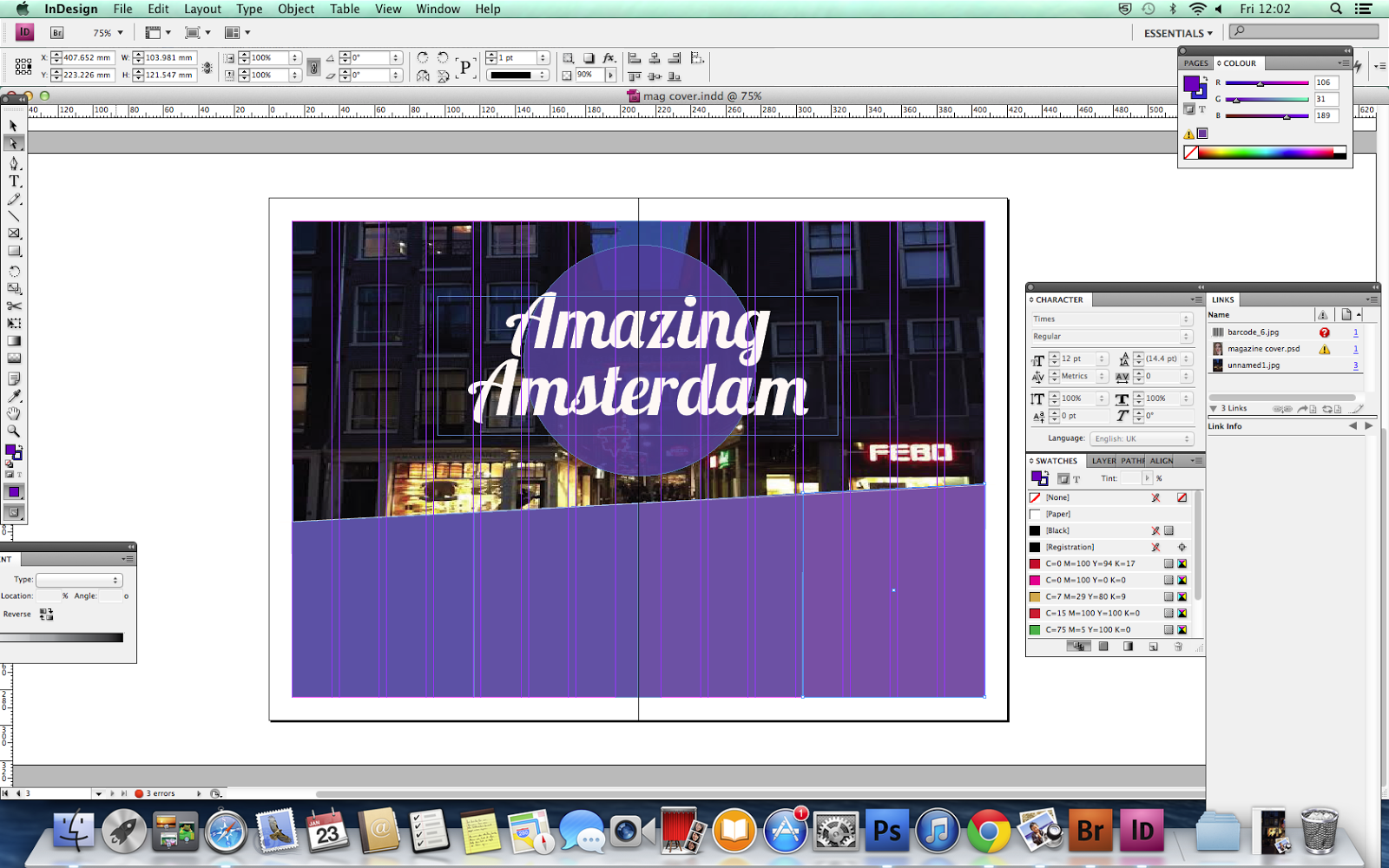
I then insert the titles into separate boxes, using the size 30 and script typeface.
 After that I added in the texts and it has the same colour as 'Amazing Amsterdam' and I also changes the colours of the titles into golden-yellow, so it contrasts with the purple which makes it stands out.
Also I made a final change for the DPS which I make the boxes 70% transparent, and so that you can still see the photo at the back through the boxes.

I then insert the titles into separate boxes, using the size 30 and script typeface.
Also I made a final change for the DPS which I make the boxes 70% transparent, and so that you can still see the photo at the back through the boxes.
Friday, 23 January 2015


Monday, 19 January 2015
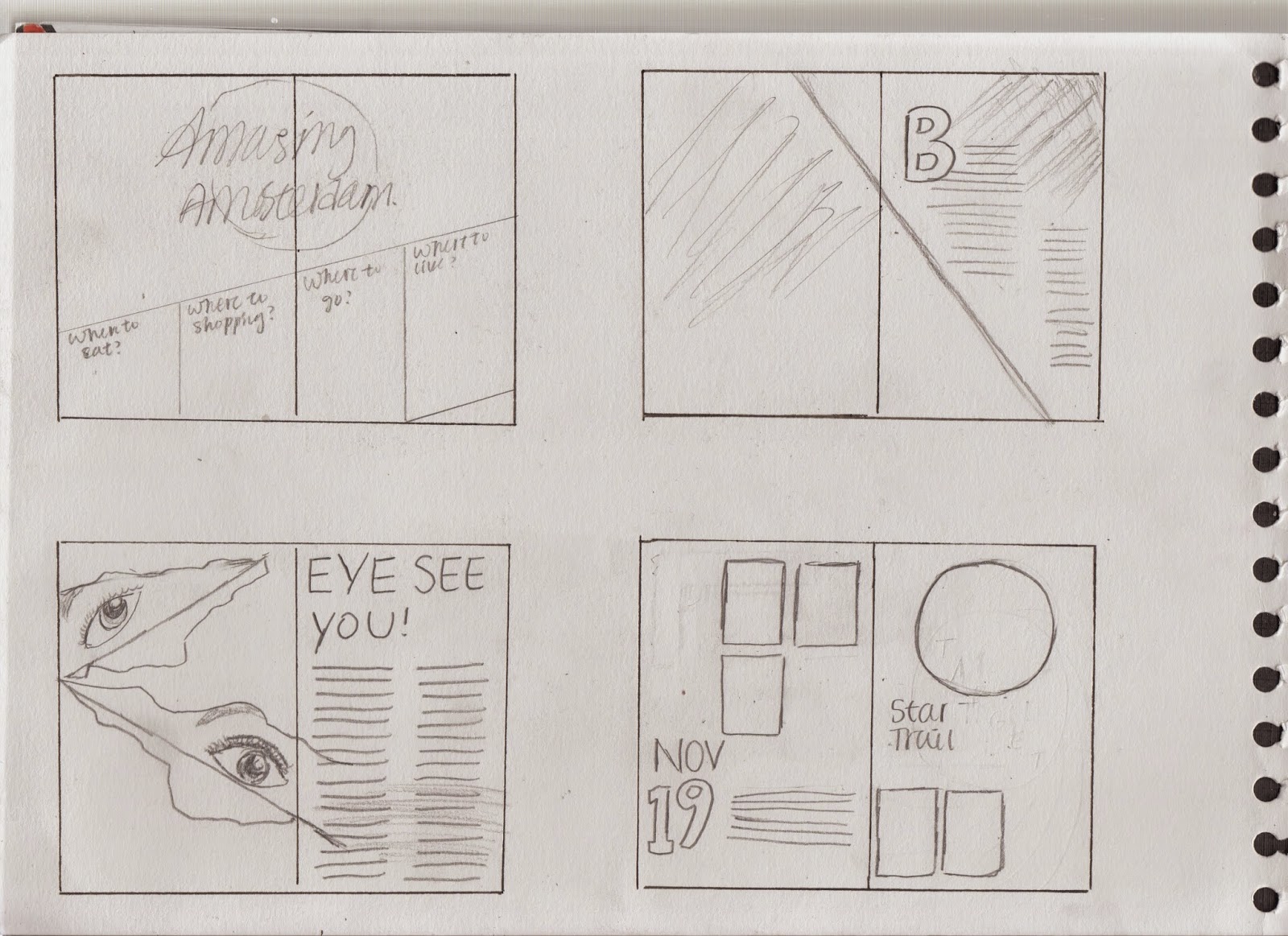
Final Design of Magazine Double Page Spread
This is the draft of the final design of my magazine double page spread.

Friday, 16 January 2015

Monday, 12 January 2015
Adjustment Layers Editing Photo
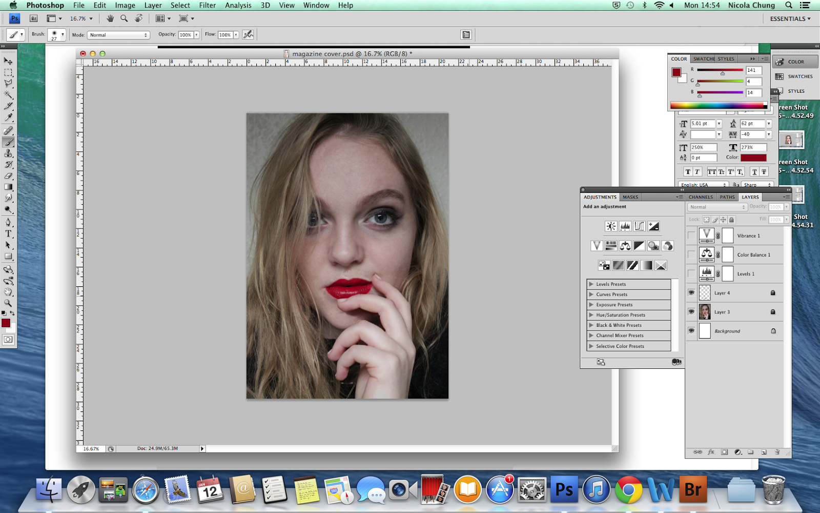
This is the original photo and I opened this in Photoshop.

First I adjust the level of the photo to make it slightly brighter than the original photo.
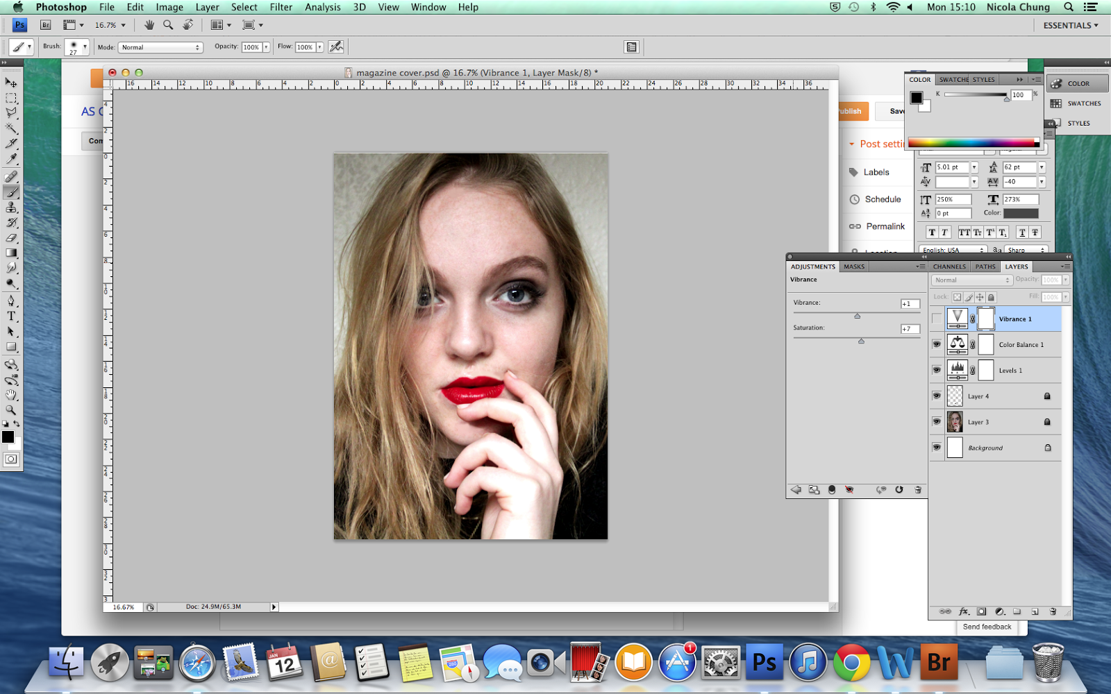

Then I adjust the colour balance of this photo, it looks slightly warmer overall as her face is brighter, the blonde hair and red lip seems much more significant.
At last I adjust the vibrance which it makes the colour stands out more, as the hair looks blonder and the red colour on the lip look much more out-standing.
Subscribe to:
Comments (Atom)